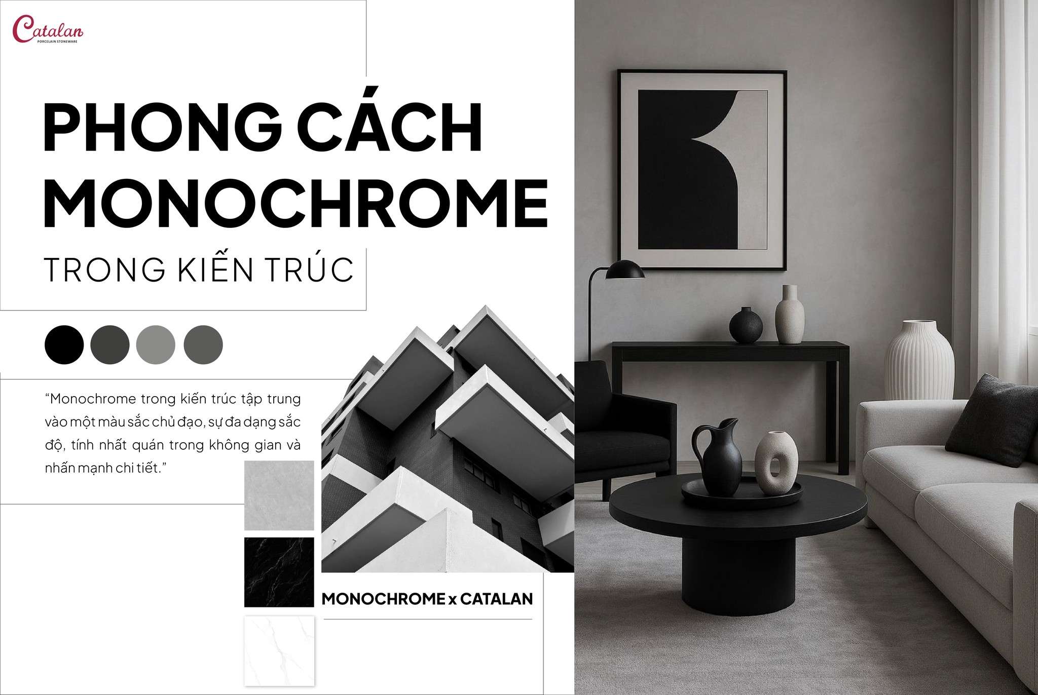
MONOCHROME STYLE AND ITS APPLICATION IN MODERN INTERIOR DESIGN
Not only popular in the fashion industry, this “one color, many shades” concept has also found its way into architecture and interior design, shaping a refined, sophisticated, and captivating design style.
 What is Monochrome style?
The term “Monochrome” originates from the ancient Greek word monochromos, meaning “one color.” This style goes beyond simply using objects of the same color; it also involves combining and exploring different shades, tones, and intensities - from light to dark - of a single color to create a harmonious, minimalist composition that still maintains visual depth.
Contrary to the common belief that Monochrome revolves only around black, white, and grey, the style can be applied to almost any color palette such as blue, beige, yellow, or greige, as long as the overall color consistency of the space is maintained.
Not only popular in fashion, the concept of “one color, many shades” has gradually entered architecture and interior design, shaping a design style that is refined, elegant, and visually captivating.
Why is Monochrome style becoming increasingly popular?
Monochrome style responds to the growing need for “cognitive relief” in a world filled with visual stimuli. Modern life surrounds people with constant streams of information - screens, advertisements, colors, and motion - which can overload the brain’s processing capacity. With its controlled color palette, Monochrome reduces the number of visual signals the brain must process, creating a sense of calm, order, and psychological comfort - an increasingly important need in urban living.
From a psychological perspective, color consistency helps people perceive their environment as more predictable. By maintaining a unified color tone, Monochrome spaces convey stability, control, and emotional balance - particularly important in residential interiors, workspaces, and environments designed for long-term experiences.
Furthermore, Monochrome strongly reflects the spirit of minimalism - “less, but better.” Today’s users are no longer seeking visual extravagance but instead prioritize lasting value, durability, and refined simplicity.
How is Monochrome expressed in architecture and interior design?
The challenge for architects when applying the Monochrome style does not lie in selecting and coordinating multiple colors. Instead, it lies in analyzing and interpreting the architectural structure in order to combine different shades of a single color in a way that highlights spatial details and forms.
When light interacts with materials, subtle contrasts between tones create a composition that feels both cohesive and dynamic.
When color is no longer the primary focal point, the human brain naturally shifts attention toward textures, proportions, shapes, and lighting. This is one of the reasons Monochrome design is often perceived as “premium” and “refined” - it requires genuine design quality rather than relying on bold colors for immediate visual impact.
Monochrome spaces are also highly adaptable to changes in furniture, decorative elements, or spatial functions without causing major visual conflicts. This makes Monochrome a sustainable aesthetic choice, less prone to becoming outdated and better suited to long-term design trends rather than short-lived styles.
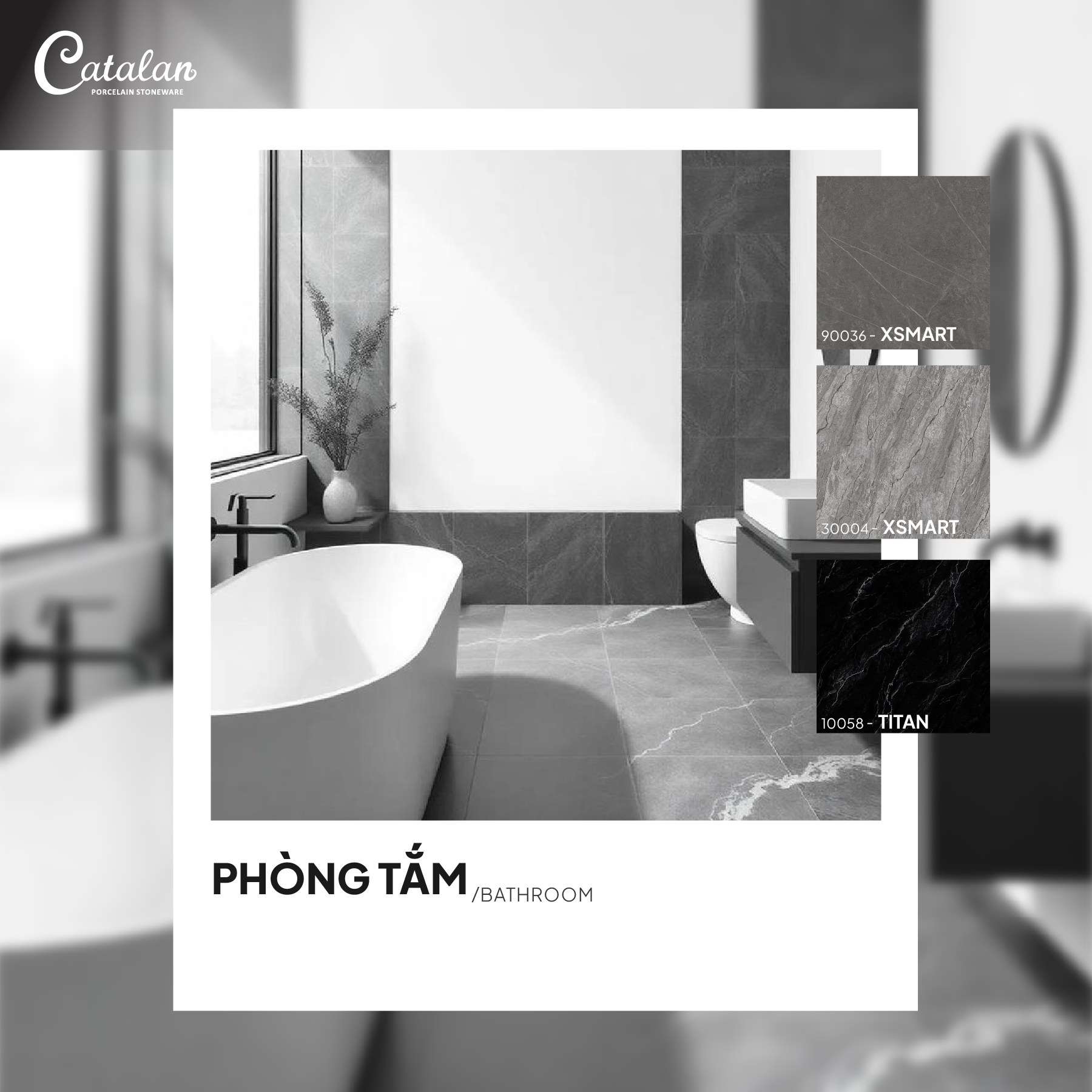
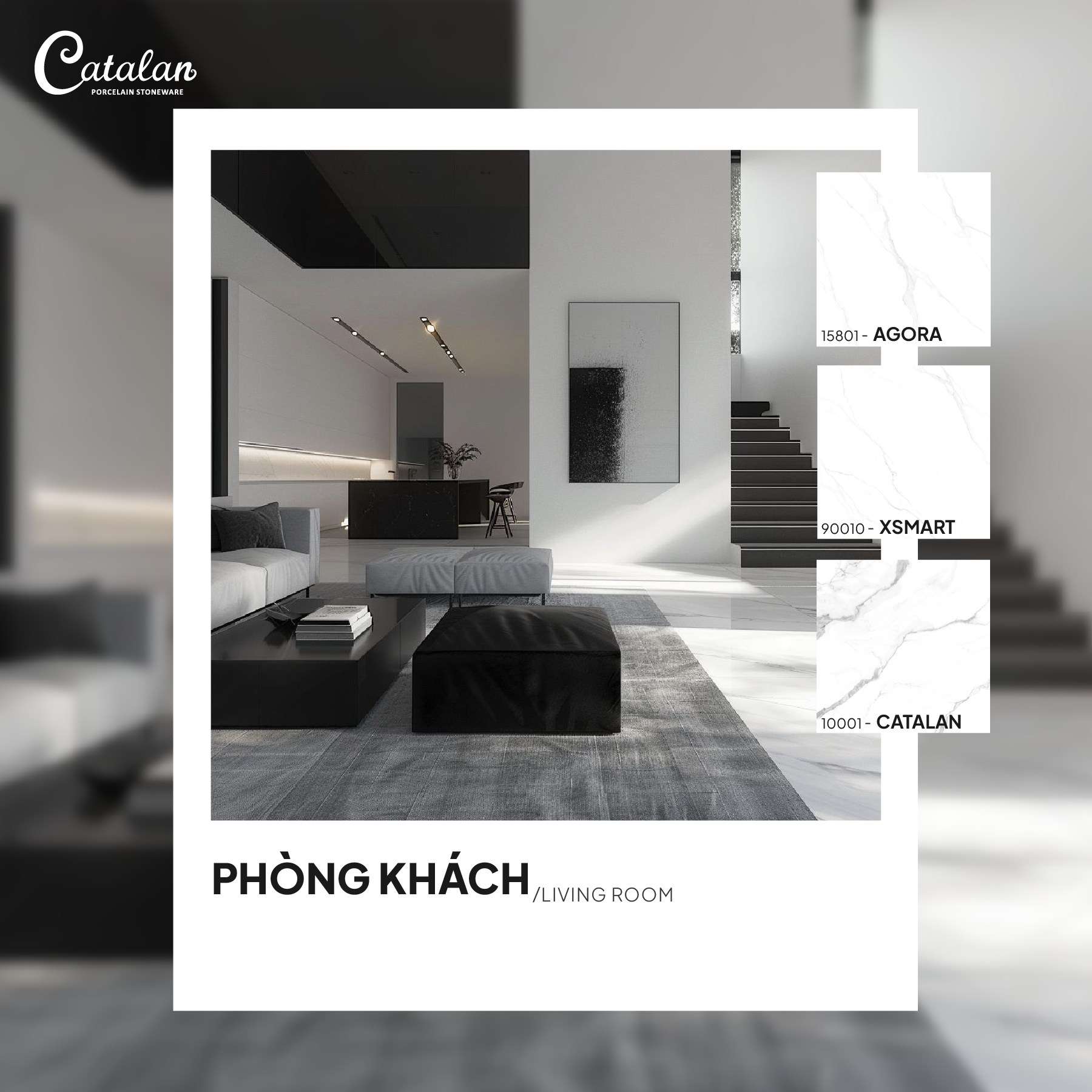
Applying Catalan tiles in Monochrome interiors
Returning to simplicity and authenticity - the core spirit of Monochrome style - is becoming a preferred direction for many designers, architects, and homeowners. Recognizing this mindset, Catalan has developed tile collections in white, grey, and greige tones, available in various sizes and designs, based on key principles:
-
Simplified color palettes
-
Emphasis on tactile material experience
-
Subtle patterns that do not overwhelm the eye
Each tile becomes a “piece of emotional composition,” allowing homeowners to create their own Monochrome spaces - modern, elegant, and rich in depth.
-Living room
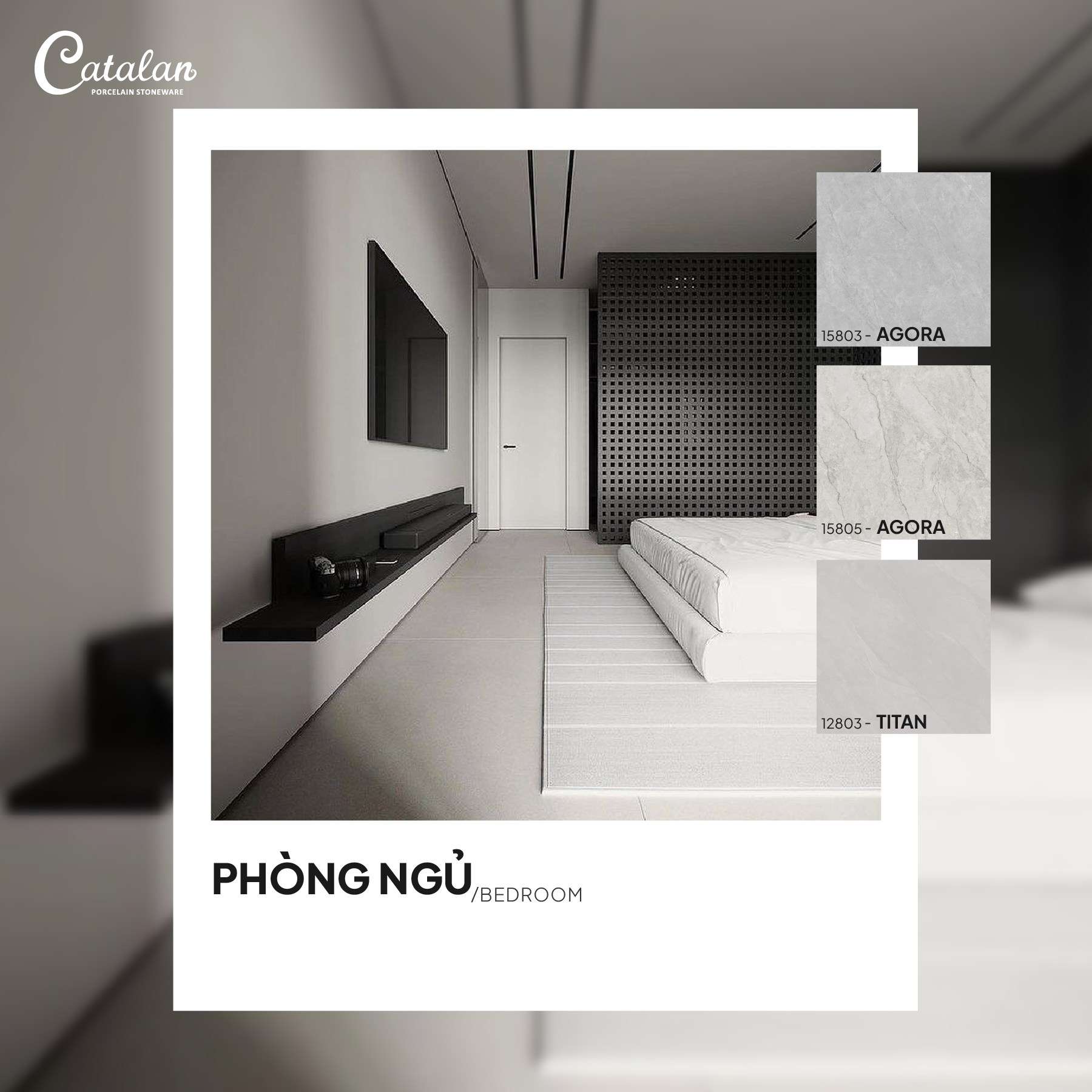
-bed room
Related posts
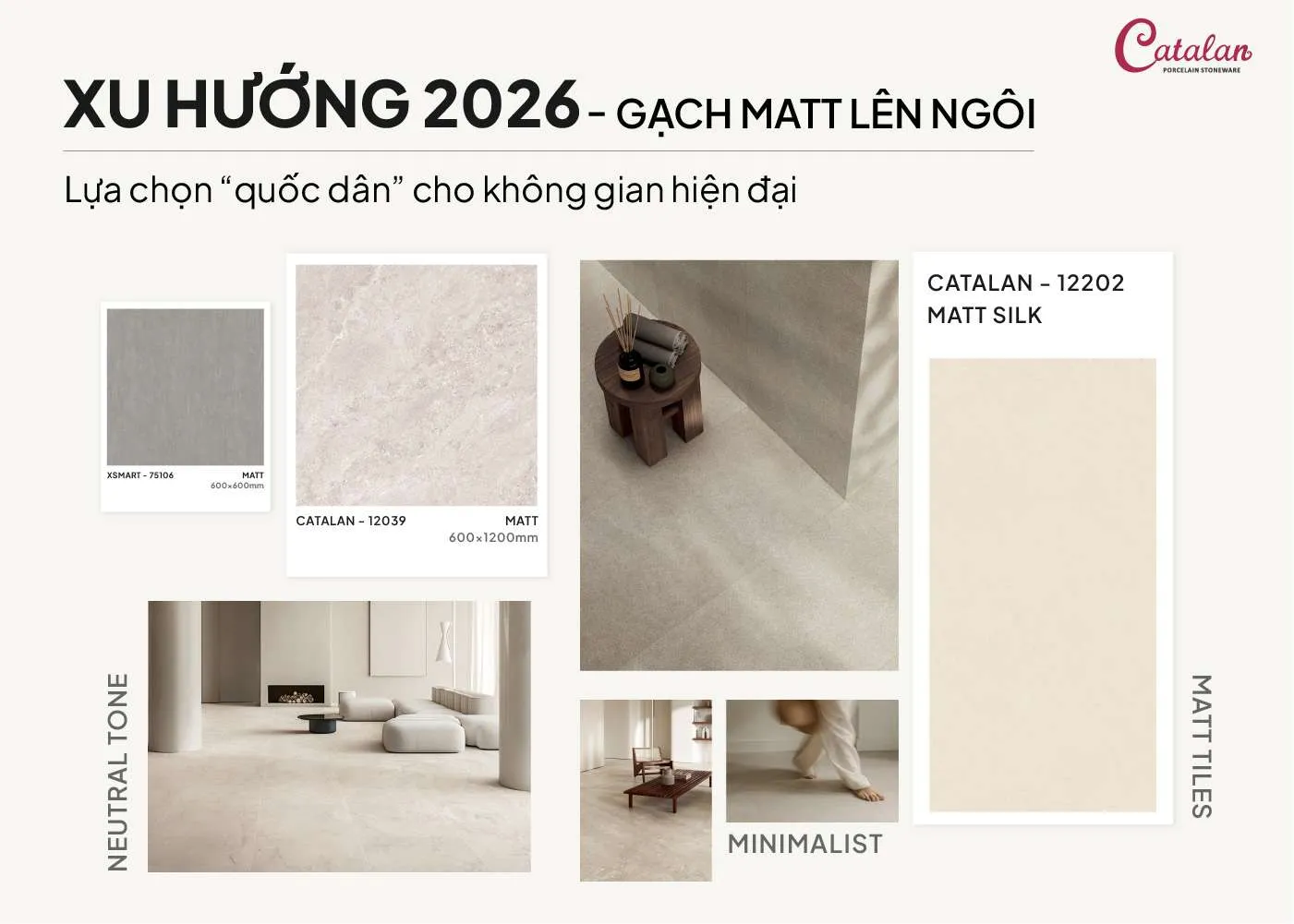
TILE TRENDS 2026: MATTE TILES TAKE THE LEAD IN MODERN SPACES
As interior design trends increasingly emphasize minimalism and living experience, finishing materials are also undergoing significant changes. Tiles are no longer merely a technical element but are gradually becoming an important factor in shaping a space. In 2026, the growing popularity of matte tiles (non-glossy surfaces) is especially evident in modern and minimalist projects.
GLOSSY OR MATTE TILES: WHICH IS RIGHT FOR YOUR LIVING SPACE?
When completing a home, every material choice not only affects functionality but also shapes the style and emotional feel of the space. Among these, glossy and matte tiles are always the two most considered options. Each offers a distinct look and experience, suited to different needs of homeowners.
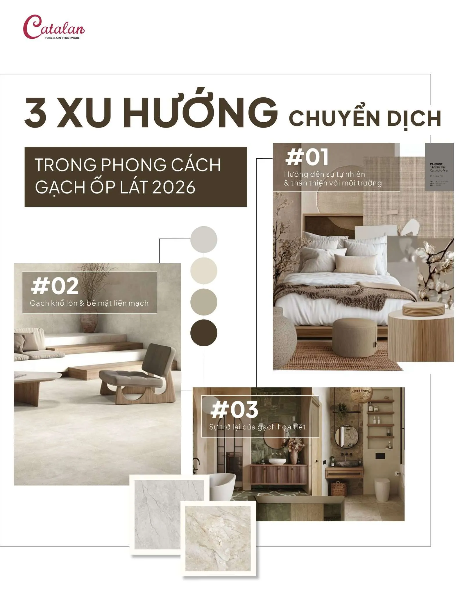
3 EMERGING TILE DESIGN TRENDS FOR 2026
Tile trends in 2026 are showing a clear emotional shift—moving toward warmth, authenticity, a closer connection to nature, and a sense of timeless character.
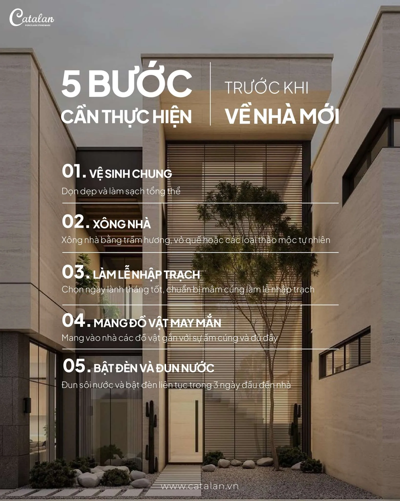
5 IMPORTANT STEPS TO TAKE BEFORE MOVING INTO A NEW HOME
Moving into a new home is an important milestone, marking the beginning of a new living space and daily routine. To ensure the transition goes smoothly, homeowners should prepare carefully from the start - from cleaning and deodorizing the space to performing basic housewarming rituals. Catalan shares five important steps to take before moving into a new home that homeowners should not overlook.